
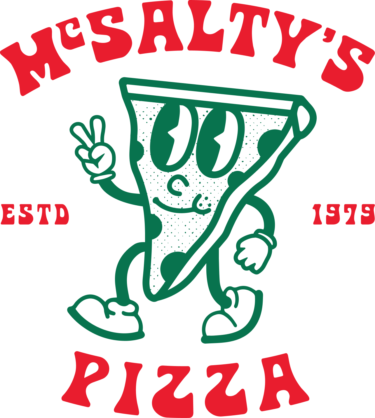
OVERVIEW
McSalty’s Pizza is a local restaurant that was in need of a refreshed identity that would stand out, attract customers, and feel approachable to a wide audience. The goal was to move beyond a generic pizza brand and create something that felt distinct, energetic, and full of personality.
Inspired by 1930s-era cartoon styles, I developed a brand direction that felt nostalgic yet timeless—bringing a sense of fun and storytelling into the customer experience while remaining functional across real-world applications like packaging, signage, and in-store graphics.
-
Brand Designer
-
Full brand identity system, illustration, packaging direction, environmental graphics
-
Brand identity development
Custom typography and wordmark design
Illustration for brand systems
Color palette development
Pattern design
Packing design
Concept Exploration
The concept exploration phase focused on defining the overall personality and visual direction of the brand. I researched vintage 1930s cartoon aesthetics to understand how expressive character work, bold shapes, and nostalgic styling could influence a modern identity system. From there, I explored how to translate that energy into a pizza brand that felt playful, inviting, and full of personality without losing clarity or usability. This phase helped establish the foundation for a brand that balances fun storytelling with real-world function.
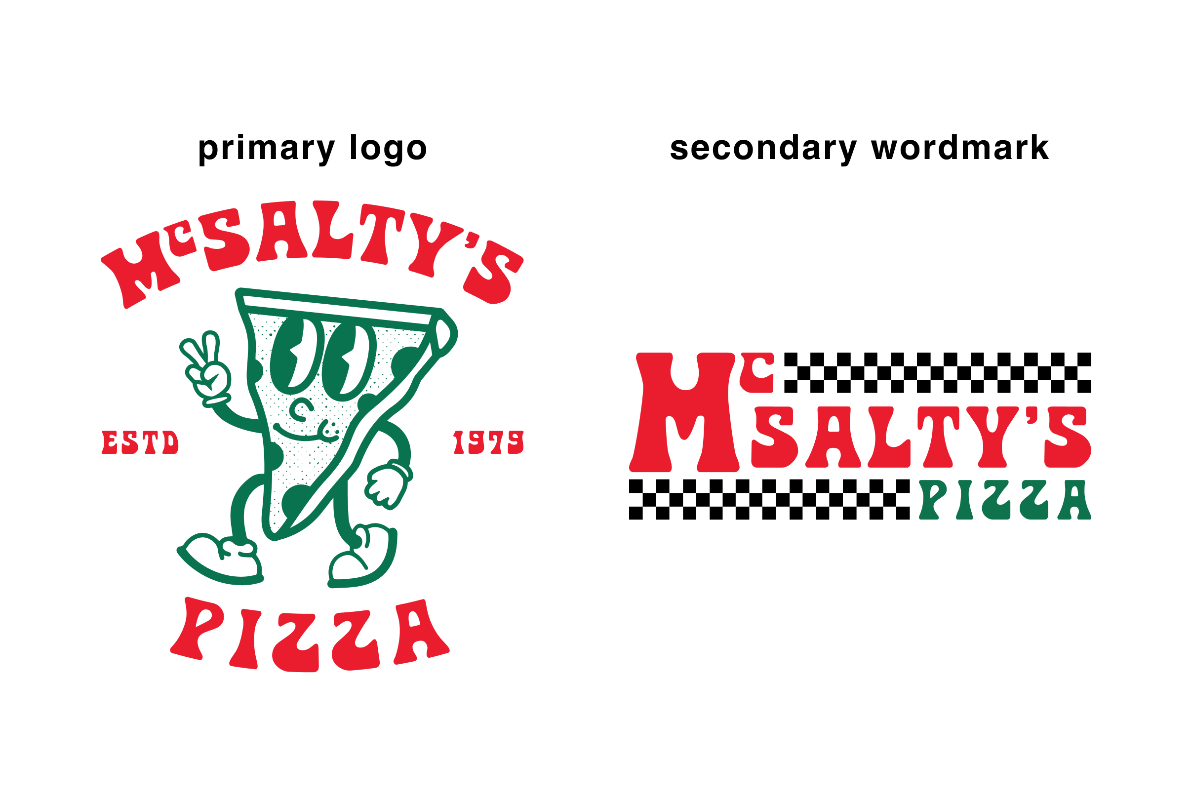
Logo Development
The logo development phase began with creating the main brand mark, which combined a custom character illustration with a distinctive logotype to establish a strong sense of personality and recognition. This primary logo set the tone for the brand by blending expressive illustration with bold, readable typography. To support flexibility across different applications, I also developed a secondary wordmark that provides a cleaner, more simplified option while still maintaining the playful character of the overall identity system.
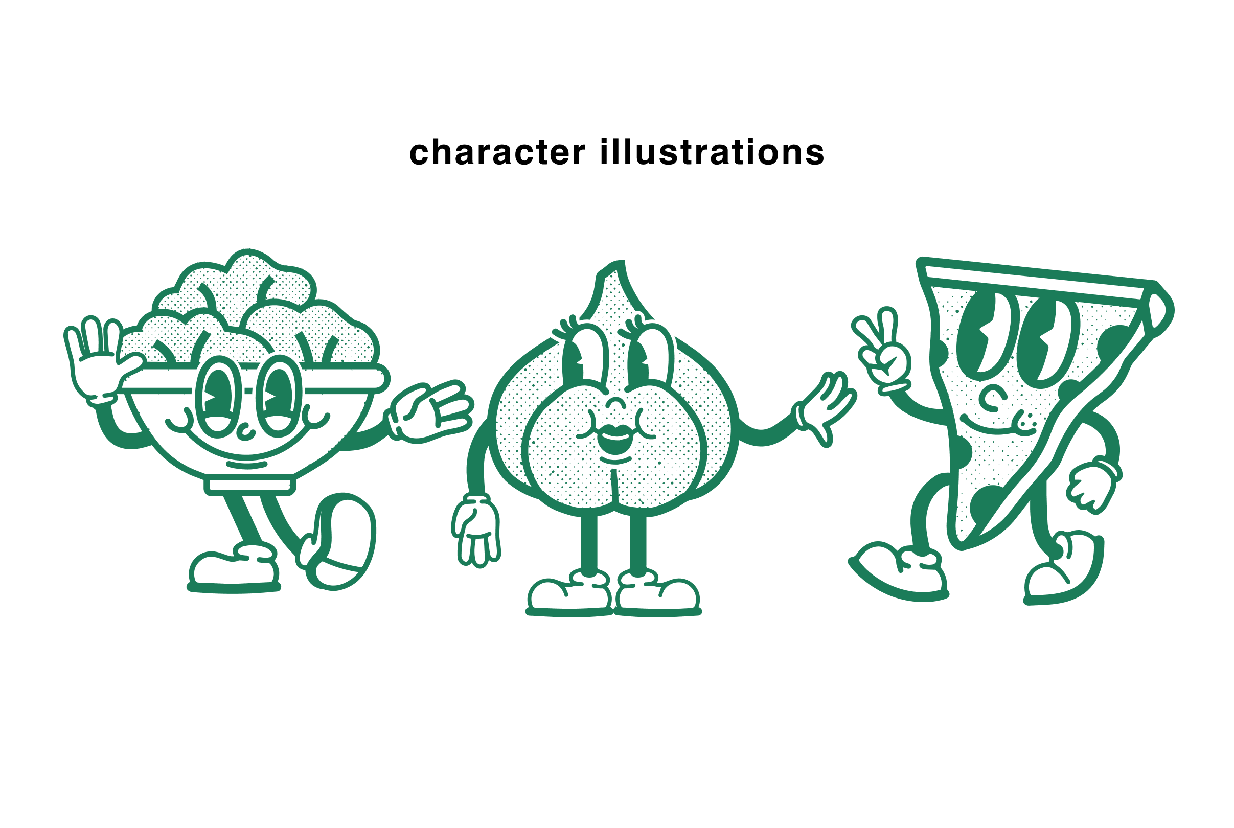
Character Development/Illustration
Character development was used to extend the personality of the brand beyond the wordmark. I explored illustrated elements inspired by vintage cartoon styles, focusing on expressive forms and simplified shapes that could easily translate across different uses. These characters were designed to reinforce the playful tone of the brand while adding depth and storytelling to the overall identity system.
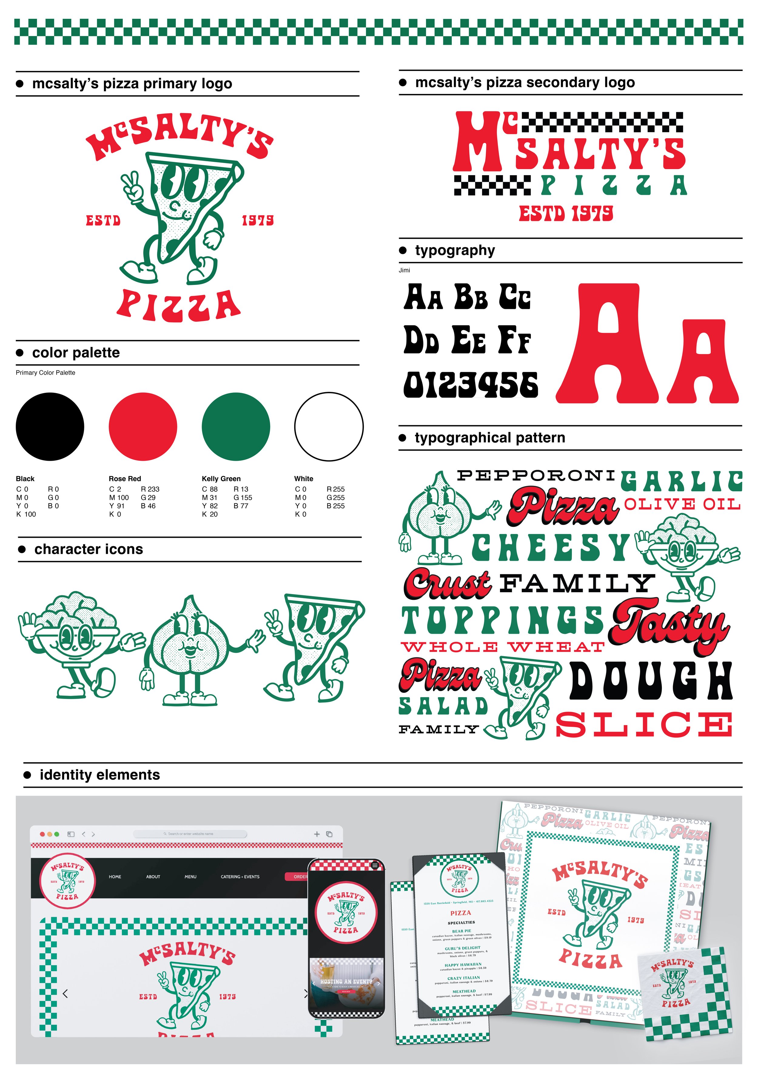
Final Identity System
The final McSalty’s Pizza identity system delivers a bold and playful brand that feels nostalgic yet modern. The system includes a custom wordmark, supporting illustrated character elements, a defined color palette, typography direction, and pattern usage, all working together to create a cohesive and expressive identity.
Applications
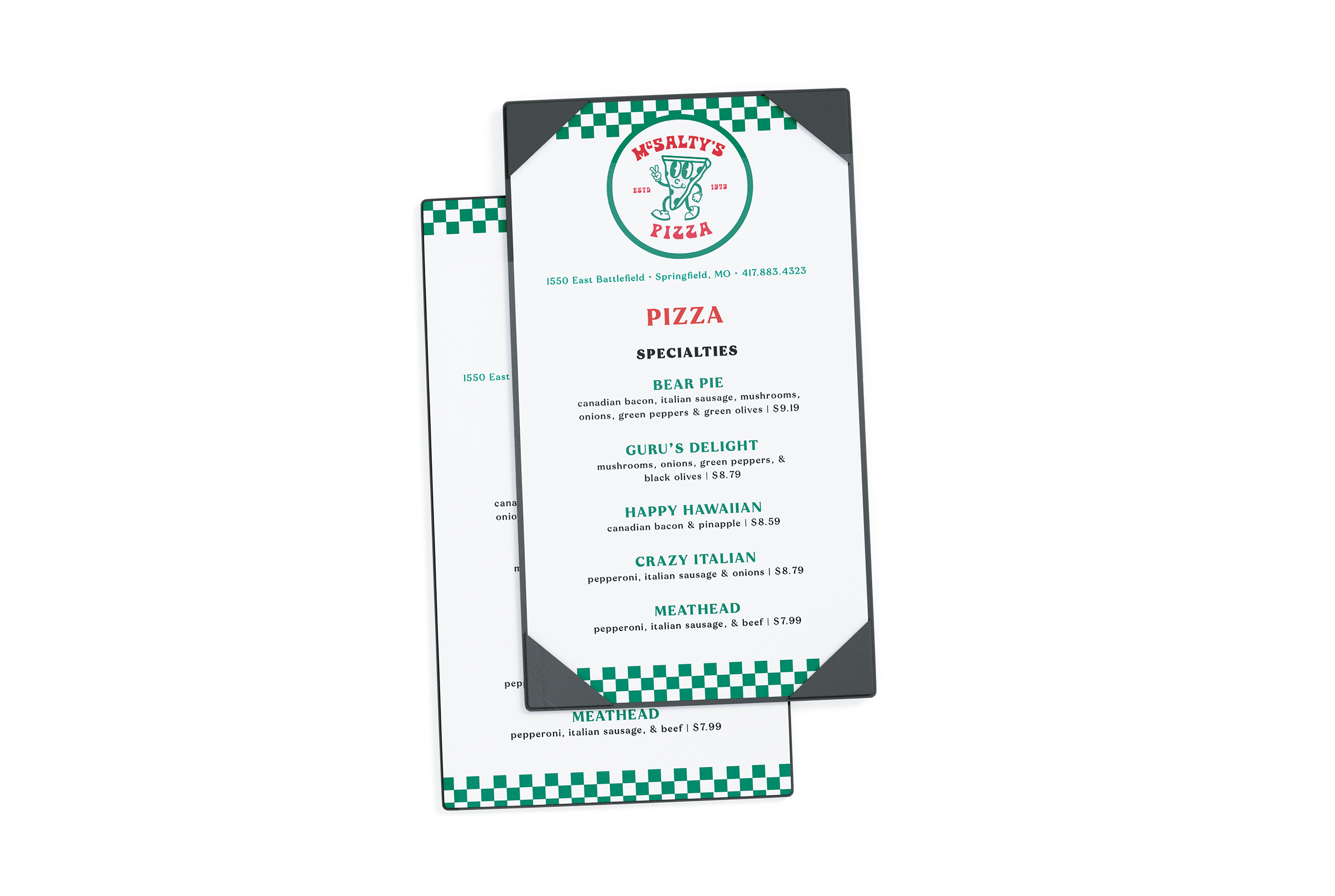
Menu Redesign
Menu redesign focused on improving readability and hierarchy, using clear typography, structured layout, and consistent branding to create an easy and enjoyable ordering experience.
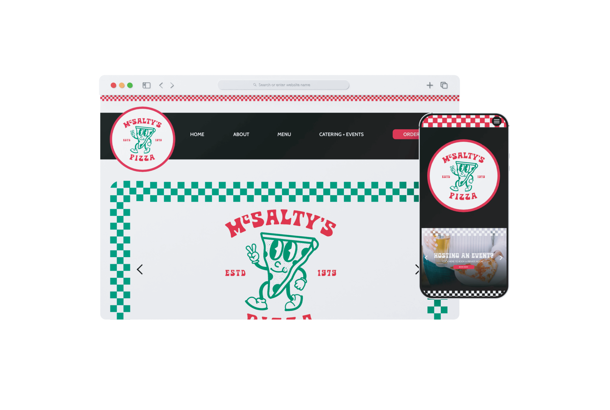
Website
Website redesign focused on improving user experience and visual clarity, creating a clean, modern interface that better reflects the brand while guiding users through content in a clear and intentional way.
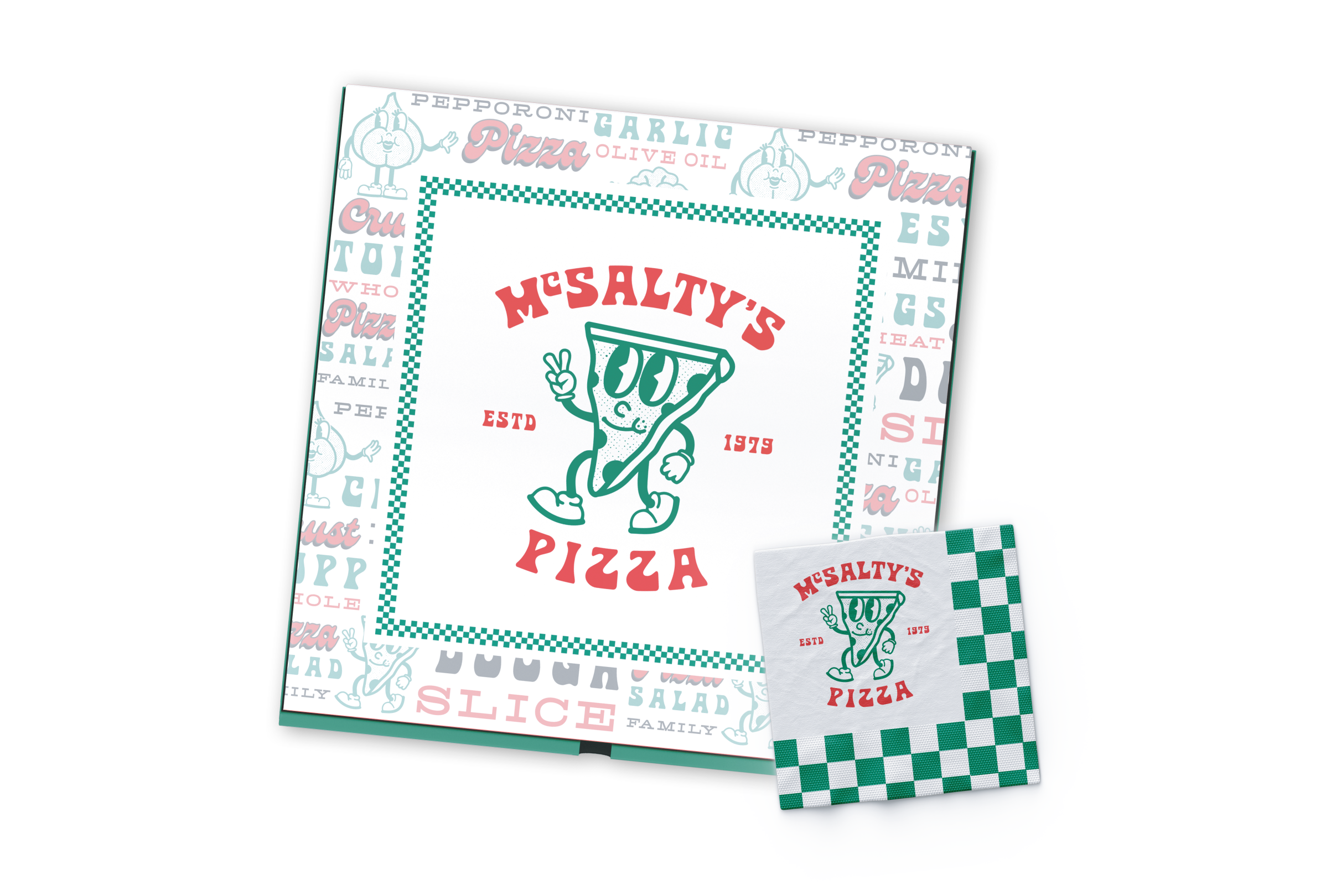
Packaging Design
Packaging design for pizza boxes and napkins that brings the McSalty’s identity to life through bold graphics, character elements, and pattern, creating a cohesive and memorable takeout experience.
-
![]()
Bass Pro Shops CLUB
-
![]()
Superior Performance Coaching
-
![]()
Bass Pro Shops Bowfishing Podcast
-
![]()
Missouri State College of Business
-
![]()
Grow With It Succulents
-
![]()
Walnut & Bloom
-
![]()
Campus to Corporate Podcast
-
![]()
KEP Farms