OVERVIEW
Walnut & Bloom is a small business that combines two distinct offerings: custom woodworking and floral sales/design. The goal of this project was to create a cohesive brand identity that could represent both sides of the business equally without feeling disconnected or overly complex.
The challenge was to design something timeless, natural, and balanced, allowing the brand to feel rooted in craftsmanship while still expressing the organic beauty of floral work. The final system needed to be flexible enough to live across signage, print materials, and digital platforms.
-
Brand Designer
-
Full brand identity system, texture exploration, and digital assets
-
Brand identity system development
Logo design
Typography exploration and pairing
Texture and pattern development
Color palette creation
Social media & email design

-
![]()
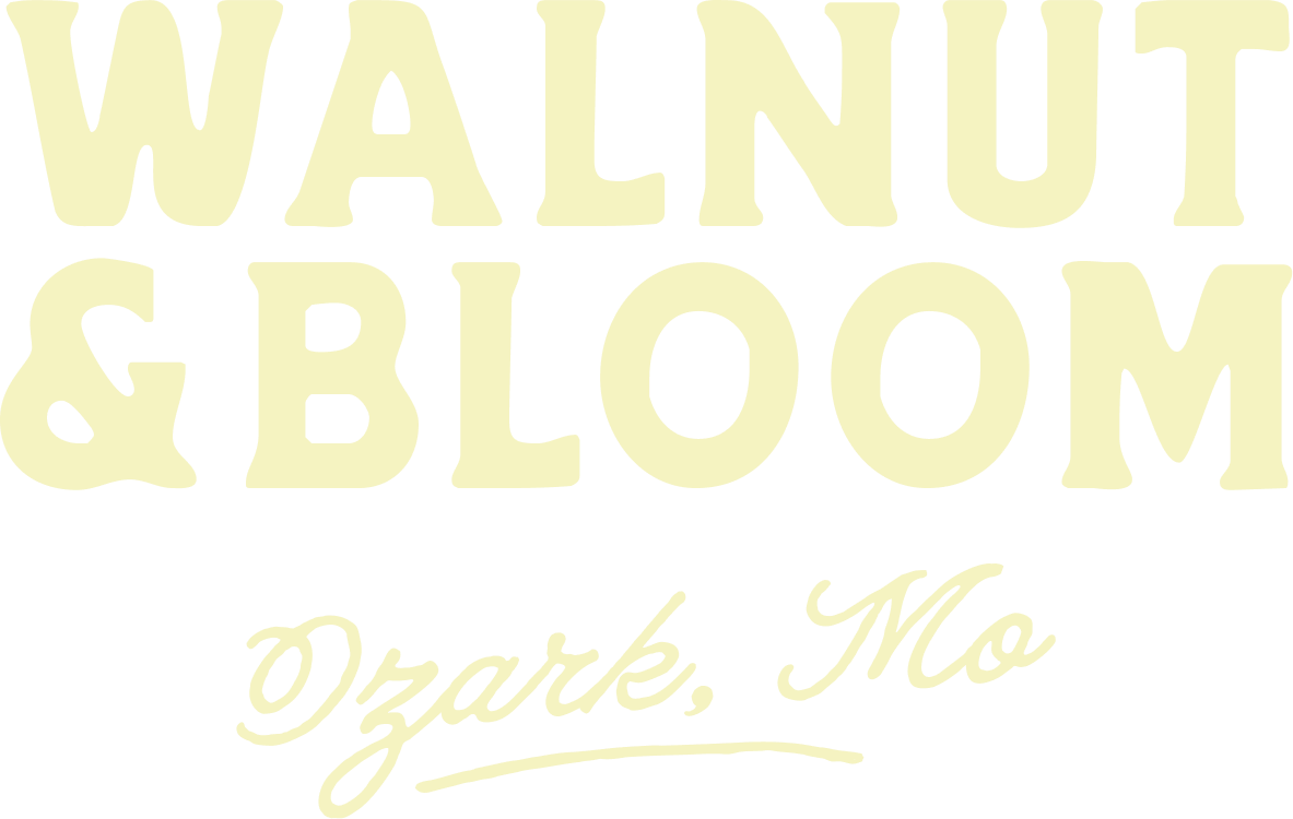
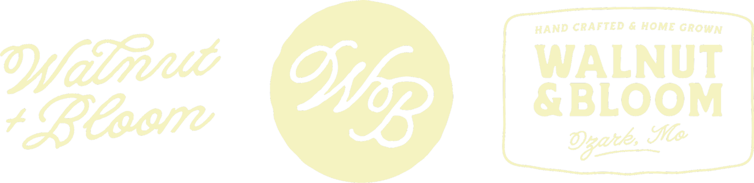
Primary Wordmark
Primary wordmark designed in a rustic typeface to feel timeless, approachable, and reflective of the brand’s handcrafted nature.
-
![]()
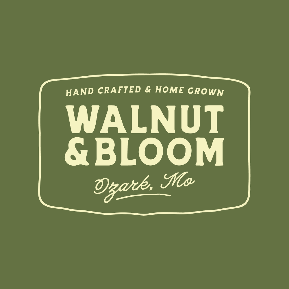
Badge
Vintage inspired badge mark designed to unify both sides of the business into a structured, versatile logo option for applications requiring a more contained identity.
-
![]()
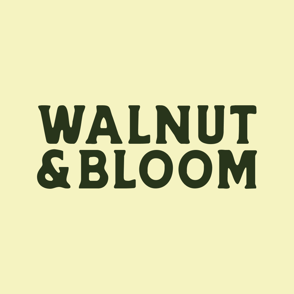
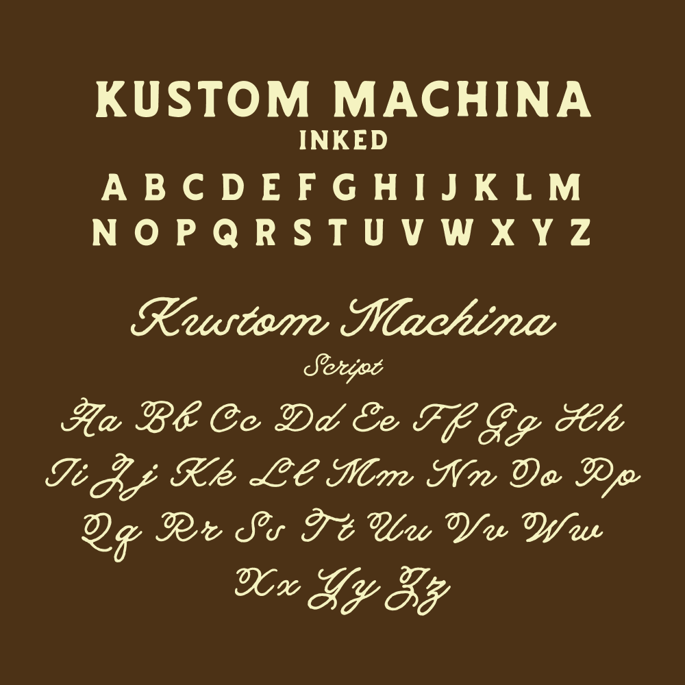
Typography Direction
Typography played a key role in balancing the brand. I used Kustom Machina to establish a look that felt both refined and approachable, pairing its strong structure with subtle softness to reflect both sides of the business. Careful attention was given to maintaining readability across print and digital formats, ensuring the type remained clear and effective in every application.
-
![]()
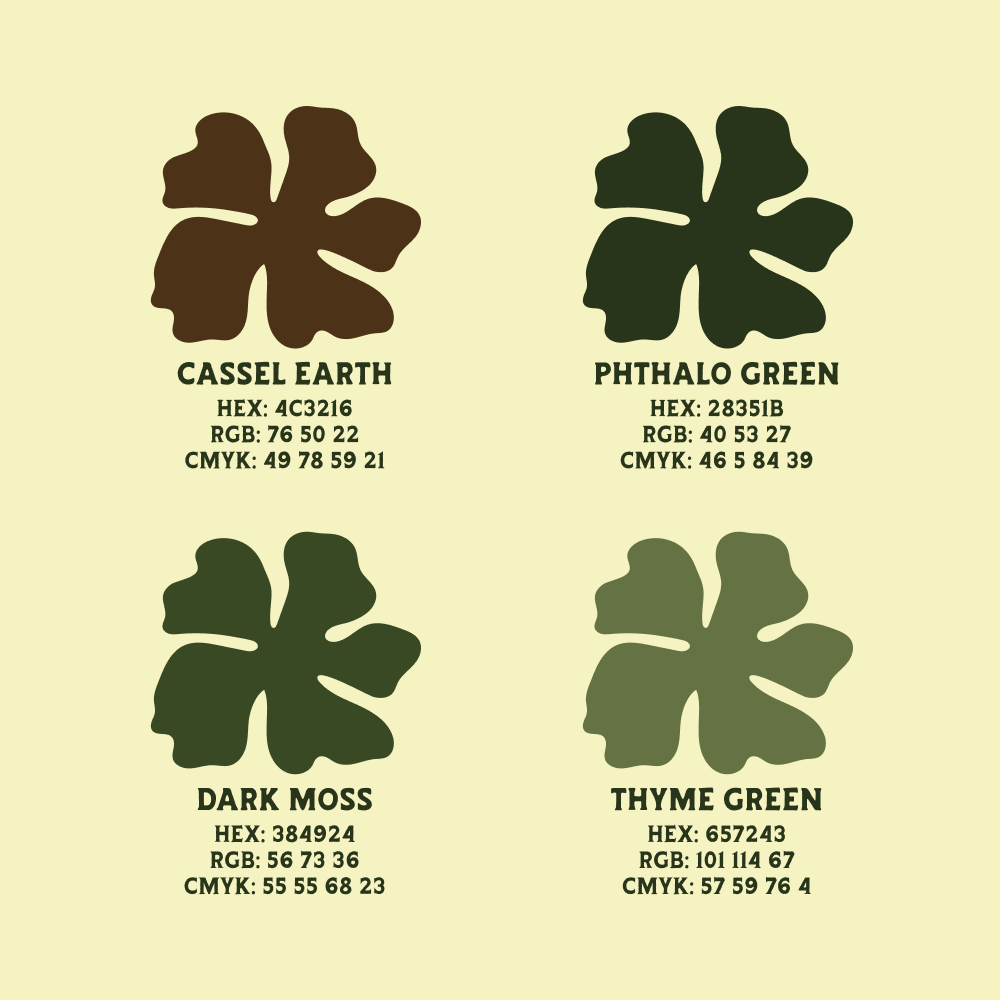
Color Palette
The color palette was developed to feel natural and grounded, drawing from tones that reflect both wood and floral elements. Warmer hues were used to create an inviting and approachable feel, while the overall palette was kept flexible to ensure it could translate well across a variety of materials and applications, from print to digital.
-
![]()
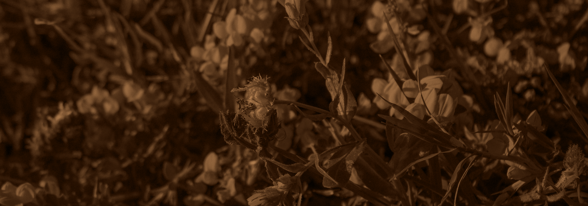
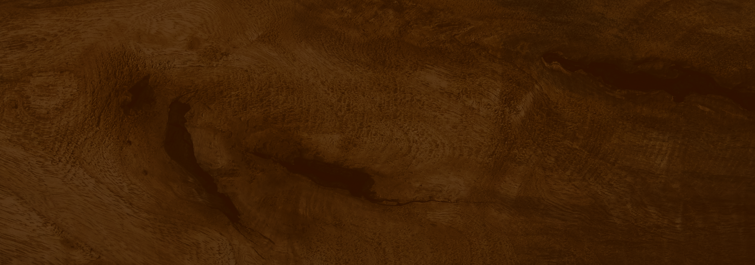
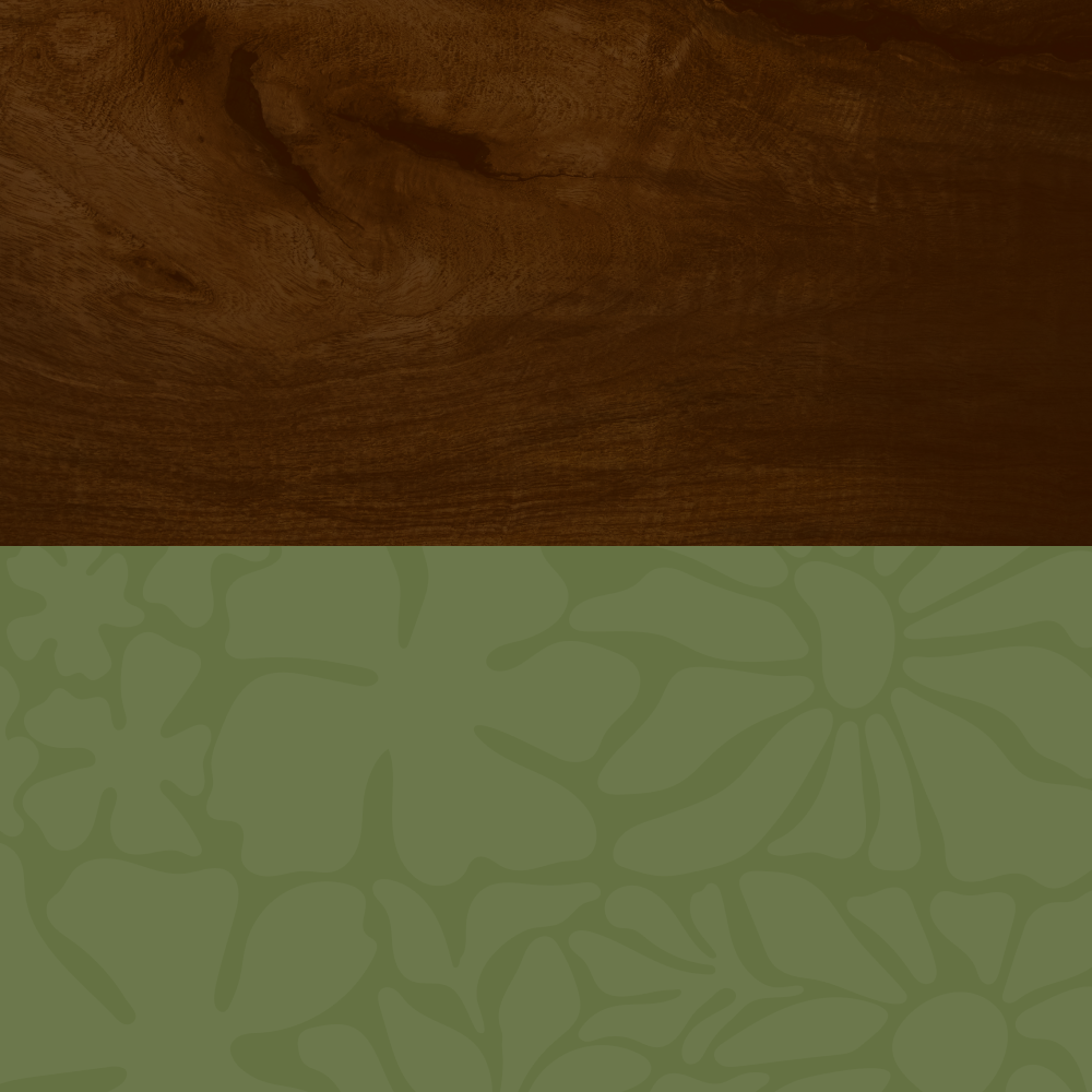
Texture & Pattern
To deepen the brand experience, I explored supporting visual elements that could reinforce both sides of the business. Wood textures were incorporated to reflect craftsmanship and materiality, while floral patterns introduced a sense of movement and organic detail. These elements were designed to enhance the identity without overpowering it, allowing for layered and dynamic applications across different touchpoints.
-
![]()
Bass Pro Shops
-
![]()
Wonders of Wildlife Aquarium
-
![]()
Bass Pro Shops CLUB
-
![]()
SHE Outdoors
-
![]()
Bass Pro Shops Bowfishing Podcast
-
![]()
Campus to Corporate Podcast
-
![]()
Trash Folder
-
![]()
Superior Performance Coaching
-
![]()
Mcleran LLC
-
![]()
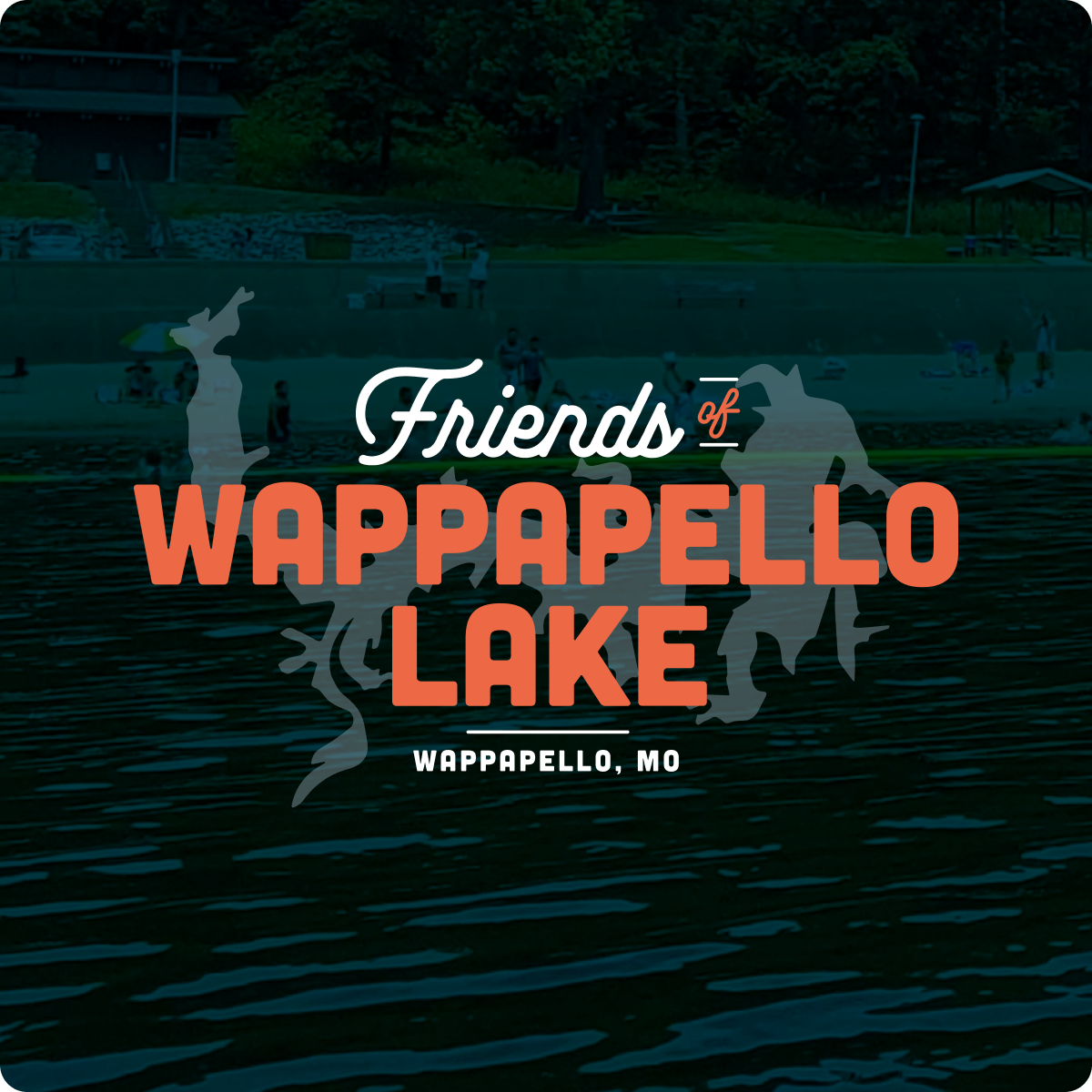
Friends of Wappapello Lake
-
![]()
Grow With It Succulents